Rate my handwriting

✨ Upload a sample of your handwriting, and our 🤖 AI will give you
the scoop on
what's awesome
and what could use a
little improving.
It's just for fun - and totally free! Try now 🚀
(You can also check out today's 👑 Leaderboard 👇)

The Romantic Penman
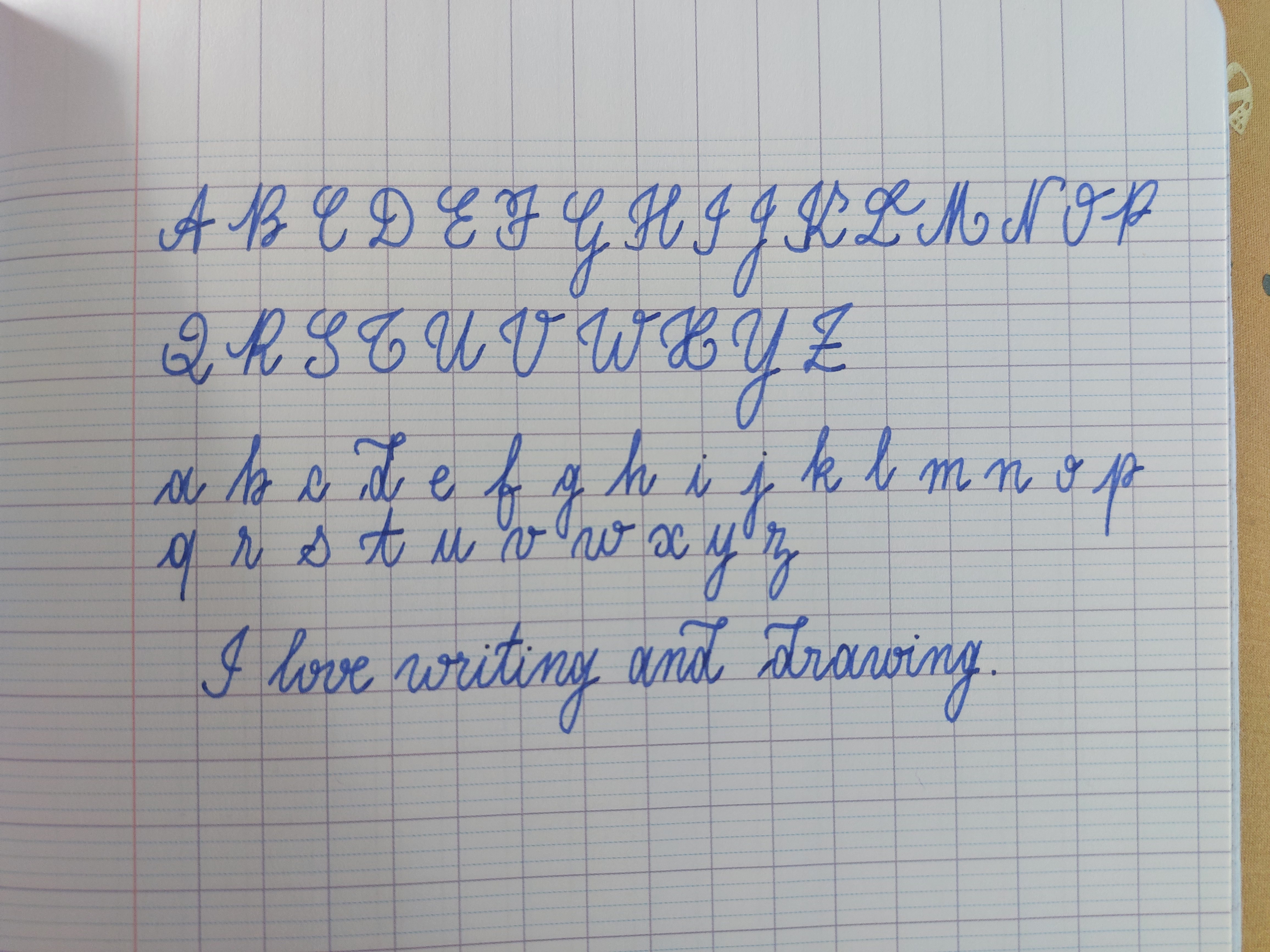
A personalized, expressive handwriting that hints at creativity and warmth. More consistent spacing between letters would enhance legibility.
This handwriting sample showcases a charming and personalized cursive style. The rounded, slightly embellished letters, especially visible in the lowercase 'g', 'y', and 'f', add a touch of elegance. While generally legible and consistent in size and slant, the spacing between letters varies, such as in 'writing' and 'drawing'. This lends an air of casualness and spontaneity.
The rightward slant of the writing suggests an open and expressive personality, someone who readily shares their thoughts and feelings. The fluid strokes hint at a love for creativity and self-expression. The rounded forms of the letters, coupled with the occasional flourish, imply a warm and approachable nature.
To improve this handwriting, focus on maintaining consistent spacing between letters. This would enhance the overall neatness and readability without sacrificing the charming, individualistic style. Experiment with different pen grips to gain more control over the fluidity of the strokes, and consider using lined paper with slightly wider spacing to allow the loops and tails of letters to fully express themselves.
Legibility
Expressiveness
Consistency
Overall
Leaderboard for Sunday, 06 April 2025
| 1 | The Diligent Scholar |
74
|
| 2 | The Diligent Scholar |
73
|
| 3 | The Casual Penman |
67
|
| 4 | The Eager Storyteller |
66
|
| 5 | The Methodical Penman |
66
|
| 6 | The Romantic Penman |
62
|
| 7 | The Springtime Penman |
62
|
| 8 | The Practical Penman |
59
|
| 9 | The Lone Wolf |
57
|
| 10 | The Precise Penman |
55
|
| 11 | The Dreamer's Quill |
53
|
| 12 | The Determined Dreamer |
52
|
| 13 | The Dopamine Seeker |
52
|
| 14 | The Dreamer |
52
|
| 15 | The Hasty Scholar |
51
|
| 16 | The Conversationalist |
51
|
| 17 | The Diligent Learner |
48
|